
The second exhibition I visited on my day off was Magnificent Maps of London, held at the London Metropolitan Archives. As the title suggests, the exhibition was made up of weird and wonderful maps of London spanning the last 500 years, from the sixteenth century to the present day. The maps document the history of the city in detail, showing the development of London from a small city surrounded by rural fields to the sprawling metropolis we know today.
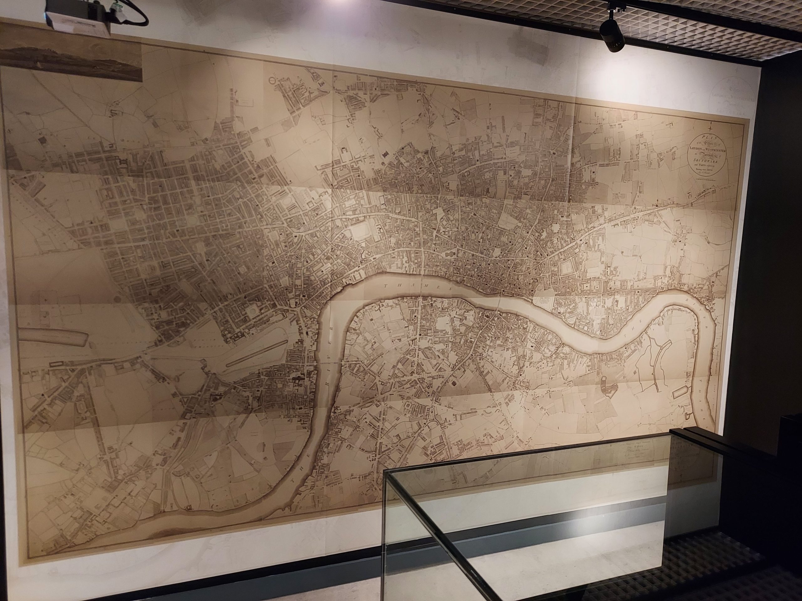
The maps displayed served different purposes. Some were designed simply to map the city, showing what was there in greater or lesser detail. Others had another purpose: maps were created to chart poverty, to show the presence of a Jewish community, track the abundance of plague, trace bomb damage, and show the prevalence of racist attacks. Maps are not neutral: they are created for a purpose, whether explicitly political or with everyday usefulness in mind.
Some maps are huge, spanning the entirety of London and taking up an entire wall. Others are small, pocket maps or guidebooks designed to help tourists and visitors to London.
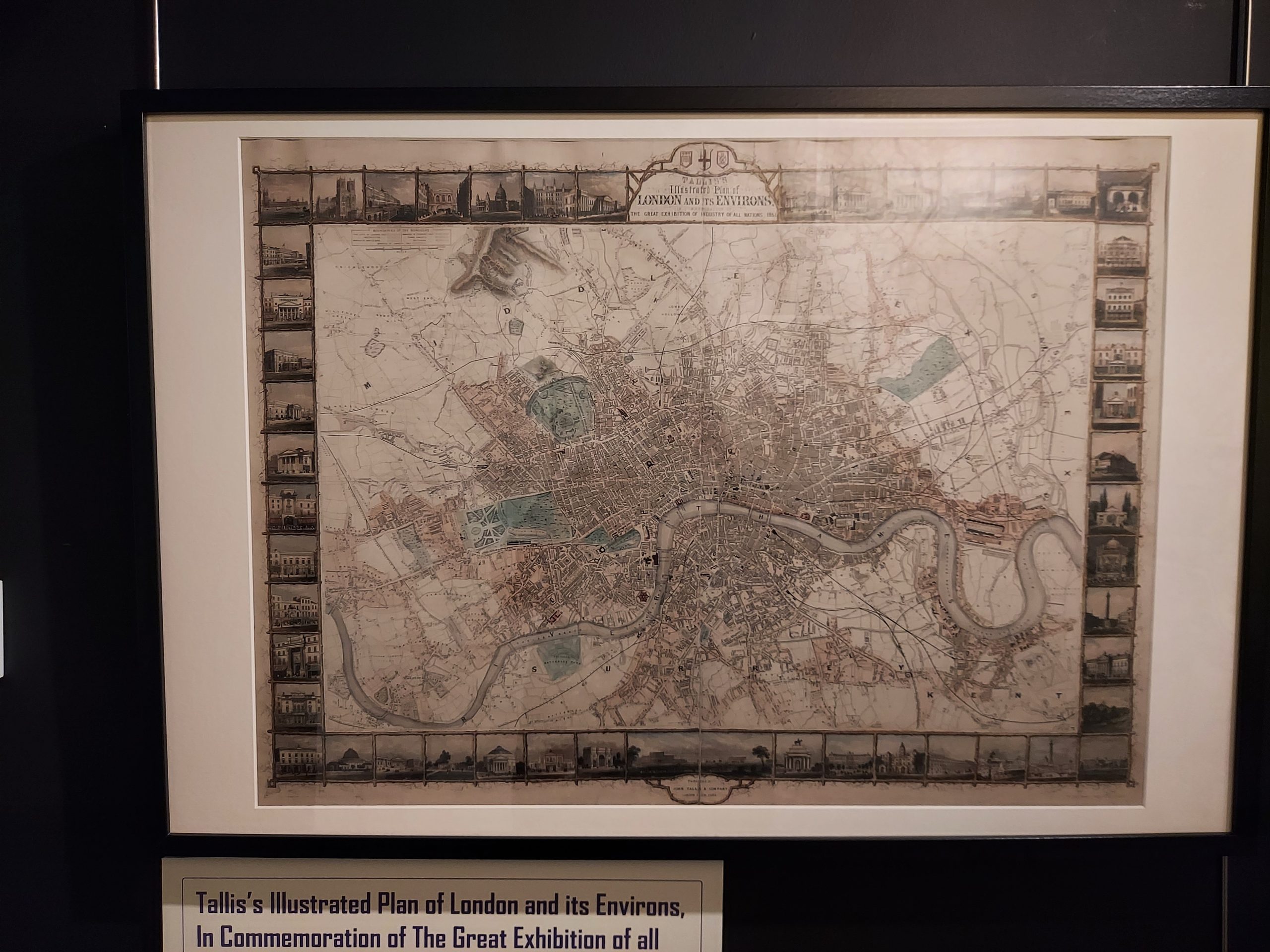
I was fascinated by all the different maps and spent ages looking at them. My favourite was the sixteenth-century map of the city showing all the theatres on Bankside. I also loved the large map which covered as far as Ealing, so I could see how my local area has changed over the years.
This exhibition is fascinating and well worth a visit – especially as it’s free. It’s open until 29 March.


