Daniel Maclise: The Waterloo Cartoon – Royal Academy of Arts

When I visited the Royal Academy in order to see the Joseph Cornell exhibition, I also popped into Burlington House’s Weston Rooms to see the smaller exhibition entitled Daniel Maclise: The Waterloo Cartoon. This exhibition, which runs until 3 January, marks the 200th anniversary of the Battle of Waterloo and is free with a ticket to one of the other major exhibitions at the RA.

The cartoon was made by Daniel Maclise, an Irish painter and illustrator, in 1858-59 in preparation for a commission at the Houses of Parliament (the finished wall art is still there), The Meeting of Wellington and Blücher After the Battle of Waterloo. The cartoon, which has recently undergone conservation treatment, is one of the largest surviving cartoons in the UK and shows the meeting of the two generals after their victory over Napoleon. Accompanied by staff and soldiers, the work showcases the intensive research Maclise undertook during his preparation, which included eyewitness accounts of the battle. The result is not always 100% accurate but is fairly close nevertheless. The size of the drawing makes an impact, as does the representation of soldiers in all states, including severely injured. The work seems to be trying to evoke an awareness of the heroism of the soldiers involved in the battle, even as it celebrates victory.

Alongside the cartoon, there are a selection of French and Italian prints representing the battle as viewed from the “other side”. Including satirical prints of British soldiers and less flattering images of the generals, they provide an interesting contrast. The exhibition is certainly worth popping into if you’re visiting the RA for Joseph Cornell or Ai Weiwei

Joseph Cornell: Wanderlust – Royal Academy of Arts

The Joseph Cornell: Wanderlust exhibition at the Royal Academy of Arts explores the life’s work of a New York-based eccentric who rarely left his home state but travelled widely in his mind. In later life, once his art had brought him success, he was offered the chance to visit Europe but declined, on the basis that he would lose the state of yearning that had helped him to produce the thoughtful, delicate works that he put together in the basement of the house he shared with his mother and brother.

The exhibition encompasses the works he created over a decades-long career. He collected photos, archives and other bits and bobs and used them to make collages and boxes, many built around particular themes. Tiny drawings and maps, place names, cutout pictures, and delicate pieces of wood and fabric are all used in his works. Some of my favourites included the box of parrots and the case in which a picture of a Victorian girl floats into the air, attached to an unseen balloon by tiny strings. The works have the air of cabinets of curiosities; they reflect Cornell’s wide interests (space, travel, history, stories of all kinds) and each one is unique.

This art is unlike any I’ve seen before, and I’m glad I made the effort to go and see the exhibition before it closed.

Reubens and His Legacy: Van Dyck to Cézanne – Royal Academy of Arts

My parents left London on Easter Sunday and I spent Easter Monday seeing some exhibitions. I began at the Royal Academy, with Reubens and His Legacy: Van Dyck to Cézanne.

The artist Peter Paul Reubens (1577-1640) was often called the “Homer of Painting”. He has been described as the most inimitable and influential painter of the Low Countries, influencing different generations and nationalities of painters over the years. The exhibition has been organised by theme.

Poetry
Natural Landscapes

The first section looks at the natural landscapes inherent in Reubens’ work and how it impacted other artists. Reubens studied natural landscapes on his estate, resulting in pictures including the Landscape with Rainbows (c. 1630) and the Evening Landscape with Timber Wagon (1630-40), which can be said to have influenced J.M.W. Turner’s The Forest of Bere (1808). Reuben also influenced British artists such as Thomas Gainsborough and John Constable.

Poetry
The Garden of Love

While landscapes inspired British artists, Reubens’ lyrical exoticism, evident in works such as The Garden of Love (c. 1635), struck a particular chord with early eighteenth century French artists. Jean-Antoine Watteau’s La Surprise (1718-19) drew inspiration from the earlier artist’s Château in a Park (c. 1632-35).

Elegance

Reubens’ portraits of Genoese high society in Italy, such as his Portrait of a Woman (c. 1625-30), impressed Anthony van Dyck and inspired painters such as Joshua Reynolds, Gainsborough and Sir Thomas Lawrence, whose Princess Mary, Duchess of Gloucester (1824) shows Reubens’ influence.

Power

Reubens worked as a propagandist and diplomat at courts through his art, including his Cycle for Marie de Médicis (1621): he painted two series of twenty-four paintings for the galleries at her new residence. He also worked on the ceiling of the Banqueting House in London. His work inspired The Triumph of Apollo, a ceiling decoration at the Louvre painted by Eugène Delacroix.

Compassion

Reubens is best known in Belgium as a religious painter, with altarpieces in Flemish and northern French churches. This aspect of his work was popular with Spanish painters, and some, which was displayed in the Louvre, inspired Romantic art such as the Sketch After Descent from the Cross (1766-69) and copies by the likes of Delacroix and Van Gogh. Claudio Coello’s Virgin and Child Adored by St Louis, King of France (1665-68) was influenced by Reubens’ Virgin and Child Enthroned with Saints. The earlier painter’s St Cecilia (1620), showing the saint playing an organ, inspired Gustav Klimt’s St Cecilia (1885).

Violence

A different side of Reubens can be seen in the works that demonstrate horror and atrocity, including some gruesome details, not least scenes of people descending into Hell and the abduction of women, which frequently inspired the Romantics. Reubens’ The Fall of the Damned (1620) inspired Charles Le Brun’s The Fall of the Angels (1685), while his The Battle of the Amazons (1617-18) inspired Arnold Böcklin’s The Battle on the Bridge (1892).

Lust

The final section of the exhibition was about lust. Reubens is probably best known for his buxom nudes, such as his work with Jan Breughel the Elder, Pan and Syrinx (c. 1617). While I can definitely see the point of those who say his pictures can be sexist, I can also appreciate the quality of his work, which influenced paintings such as Paul Cézanne’s The Bathers (c. 1875) and Auguste Renoir’s Bather with Long Hair (c. 1895).

Overall, I found this to be an interesting exhibition and I did learn a lot. It emphasised the extent of Reubens’ influence over other artists and left me more aware of his impact.

Giovanni Battista Moroni – Royal Academy of Arts

The second exhibition I saw on Sunday was Giovanni Battista Moroni at the Royal Academy. I had never heard of this Renaissance artist before, but I found myself admiring his pictures greatly.

Moroni was the son of a stonemason and was born in Albino, north Italy, in the 1520s. During his lifetime he was acclaimed as the leading painter in Bergamo, but his reputation has fluctuated over the centuries.

Moroni preferred to paint with a representation of reality rather than create artificial, idealised portraits. As a result his pictures have insight and presence. Some portraitists of the era produced what, to me, appear as not-very-interesting pictures of the nobility, but Moroni’s paintings are different. I particularly liked his Portrait of a Lateran Canon (c. 1558) – the canon looks at the viewer with a wry smile, which led me to wonder what he was thinking! Another interesting picture is the Portrait of a Tailor (c. 1570), in which the tailor in question is full of personality.

This is a really fascinating exhibition which is definitely worth seeing. It runs until the 25th of January.

Dennis Hopper: The Lost Album – Royal Academy of Arts

Dennis Hopper: The Lost Album is the exhibition that opens the Royal Academy of Art‘s new Burlington Gardens space. It includes photographs by Dennis Hopper, an actor who shot to fame with roles in films such as Apocalypse Now, Easy Rider and Blue Velvet. I have to admit that I had never heard of him – either as an actor or as a photographer – but I thought that the exhibition, covering the life of the star in the 1960s, would be an interesting one.

It certainly is fascinating to explore the world of American life and culture in the 1960s, one of the most momentous decades for social and political change in history. The pictures capture the worlds of Hell’s Angels and hippies, the Civil Rights movement, stars of film, fashion and music, and the urban landscapes of the US.

Unfortunately though, the exhibition was incredibly expensive and I don’t honestly feel that it was worth it. RA exhibitions are expensive anyway, but I normally feel as if a lot of work has gone into them. These photographs were presented with little explanation and few captions. I don’t feel that the exhibition was worth the price paid, even though I did enjoy it. If you do think you might be interested, the exhibition closes this weekend so hurry.

Anselm Kiefer – Royal Academy of Arts

At the weekend I attended the Anselm Kiefer exhibition at the Royal Academy of Arts. The German artist has been described as a “colossus of contemporary art”, and I decided to go and see for myself.

The exhibition really begins before you even enter the RA, with “Velimir Khlebnikov: Fates of Nations: The New Theory of War” on display in the courtyard. It consists of two large glass vitrines containing model submarines. It’s a melancholy, imposing work, inspired by the Russian Futurist figure Khlebnikov, who came to the somewhat bizarre conclusion that a major sea battle took place every 317 years (or multiples thereof).

2014_0928AnselmKiefer02

2014_0928AnselmKiefer01

Inside, another of Kiefer’s sculptures is on display before you reach the exhibition: “Language of the Birds” (2013) is made up of books, folder chairs and a pair of wings. It looks like it is about to take off. The sculptures (including “Ages of the World” in the exhibition itself) were in fact my favourite thing about the exhibition: they have an impressive looming quality about them.

The rest of the work I wasn’t so sure about. I admired Kiefer’s attempt to confront the reality of Germany’s history; his early work involved painting himself wearing his father’s German army uniform in a series ironically entitled “Heroic symbols”. He aimed to reclaim the idea of the artist from the Nazis, a concept which had been tainted by the emphasis on Hitler as an artist. I also liked a painting which re-enacted a Nazi naval attack inside a standard-issue tin bath, a commentary of the ludicrousness of the war.

Other works included watercolours, books, three-dimensional pictures and installations, using materials as diverse as greenery, lead, diamonds and wood. Paintings made use of myths, symbols, landscapes and architecture. The exhibition was varied in subject, but there was a recognisable style running through all of Kiefer’s work.

Overall I don’t think that this art is really for me, however I feel I learned something from it – I certainly wouldn’t call it a wasted experience.

Radical Geometry: Modern Art of South America from the Patricia Phelps de Cisneros Collection – Royal Academy of Arts

I attended the new exhibition at the Royal Academy on the hottest day of the year. After sweltering in the heat, it was a relief to step into the cool, dark Sackler Wing of Galleries in Burlington House to see Radical Geometry: Modern Art of South America from the Patricia Phelps de Cisneros Collection.

Radical Geometry looks at the original and radical art of South America over the last 100 years. In the early to mid-20th century, artists from the region began to innovate and pioneer a new visual language to evoke their beliefs about art. In the beginning this coincided with a sense of optimism in the region, with a strong economy and progressive politics dominating. Cities across South America began to see themselves as an integral part of the world, not on the periphery. However, artists from these cities did vary as to their approaches to art.

In Buenos Aires, artists were often political, with strong left-wing leanings expressed in their art. In Brazil as a whole, many had an intellectual focus and also worked with poets, while Venezuelan artists integrated their work with buildings. In Montevido, capital of Uruguay, Joaquín Torres García blended pre-Colombian art with European avant-garde to create a unique style, though in Argentina he was seen as old-fashioned, with many artists rejecting traditional models (Rhod Rothfuss, for instance, rejected the traditional picture frame); several of these were Marxists. In Brazil, great changes during the 1950s and 1960s meant the creation of new wealth, and there was a rivalry between up-and-coming São Paulo and former capital Rio de Janeiro. The first Biennial Exhibition outside of Venice was held in São Paulo in 1951.

Abstract-style art isn’t normally my thing, but I found the clean lines and shapes really restful after coming in to the cool gallery from an extremely hot and sunny courtyard. I found a lot of the exhibition really thought-provoking – I had never considered, for instance, why paintings have square or rectangular frames (except for the odd round artwork), and that they could be framed differently. I also loved the sculptures, such as Sphere (1976) by Gego (Gertrude Goldschmidt). My favourite piece, though, was Physichromie No. 500 (1970) by Carlos Cruz-Diez, which seemed to change colour as I walked past it.

This wasn’t my usual sort of exhibition, but I really enjoyed learning about South American art and how it reflected the wider societal ambitions and beliefs of the artists. It is definitely worth visiting – it runs until 28 September.

Norman Stevens ARA: Selected Prints – Royal Academy of Arts

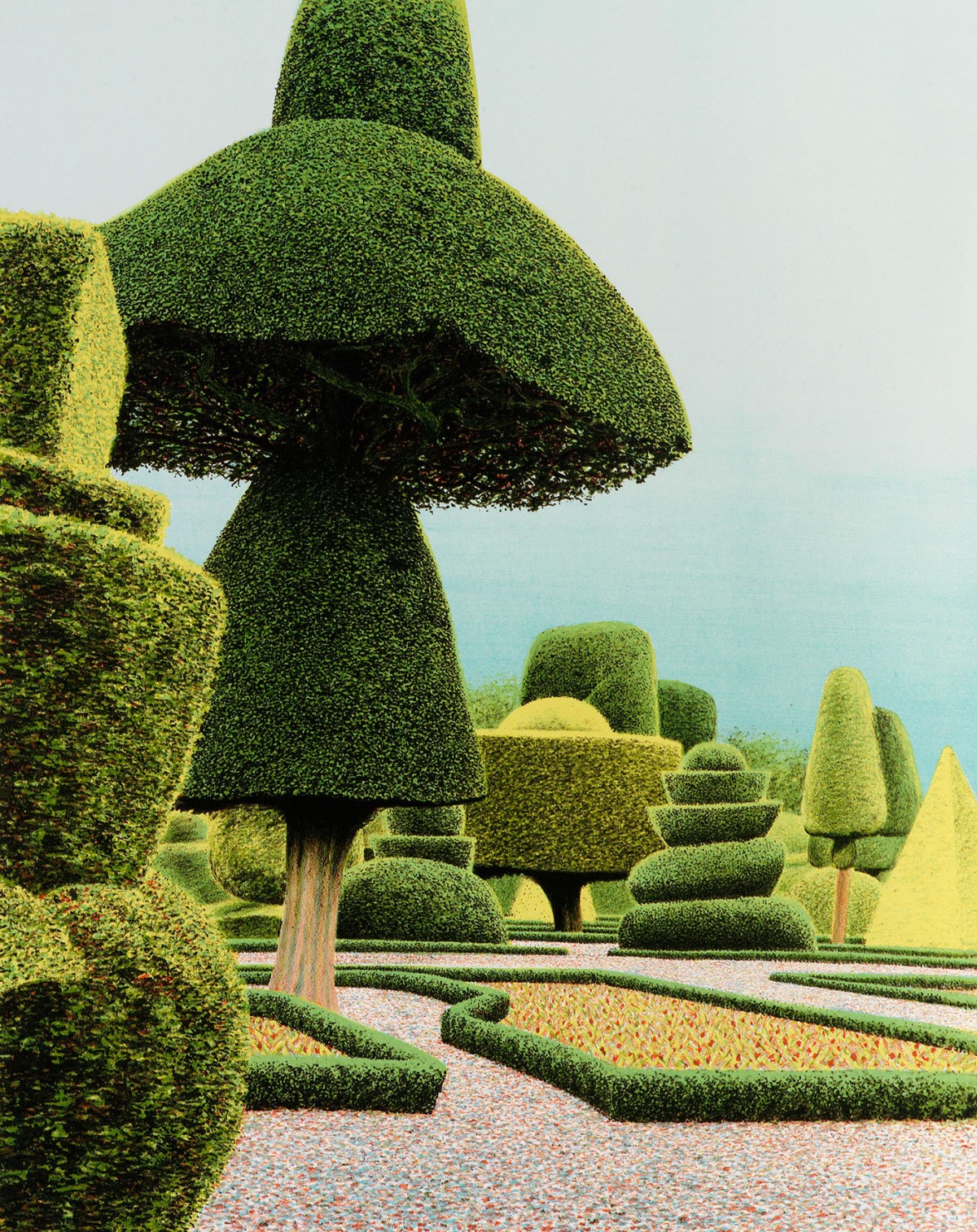
While in the Royal Academy I came across a small exhibition in the Tennant Gallery and Council Room. This was a selection of prints by Norman Stevens, and it was free with any other exhibition ticket, so I popped in. I had never heard of Stevens but I liked his prints: they were reminiscent of a dreamlike English ‘country garden’ but there was something unworldly or unnerving about many of them. I particularly liked his Levens Hall Garden, which reminded me of Alice in Wonderland.

Levens Hall Garden
Norman Stevens ARA Levens Hall Garden 1985 Screenprint Private collection © Estate of the artist

Renaissance Impressions – Royal Academy of Arts

While I was at the Royal Academy I decided to go and see Renaissance Impressions, which is running to the 8th of June in the Sackler Wing. This exhibition focuses on chiaroscuro woodcuts from the collections of Georg Baselitz and the Albertina in Vienna.

Before I visited, I had no idea what chiaroscuro woodcuts actually were, so I was happy to be enlightened. There is a helpful video at the beginning of the exhibition that shows you how they are made. They are like standard woodcuts – e.g. cut out a pattern on some wood (doh), cover with paint, and press onto paper – but you do it in layers. So you have one woodcut for the lighter tones, and you print that; then another for the highlights, and you print that; and finally, another for the outlines which is very dark. The technique results in beautiful, layered pictures full of atmosphere. Some are mainly black and white, while others involve the use of colour. There is more information, as well as a stunning selection of images, on the Royal Academy website.

Sensing Spaces: Architecture Reimagined – Royal Academy of Arts

2014_0330SensingSpaces01
Royal Academy of Arts

The Royal Academy of Arts has been doing something a little different recently – their latest exhibition, Sensing Spaces: Architecture Reimagined, has allowed architects to take over some of their galleries with innovative designs. It marks a departure from their usual kind of show, as you are able to walk around, touch and in some cases walk through the exhibits, and there were lots of children who were clearly enjoying themselves just as much as the adults.

Featuring architects from all over the globe, the exhibition is designed to show that architecture is not just a visual medium: it affects how you perceive a space in terms of scent, touch, hearing and feeling.

On entering the exhibition space you are able to go any way you like. I chose to go straight ahead and came across this installation by Eduardo Souto de Moura, a reconstruction of the wall’s archway.

2014_0330SensingSpaces03
Eduardo Souto de Moura

The next work was pretty hard to miss, and I think it was my favourite out of the lot. Diébédo Francis Kéré has created a huge plastic tunnel that visitors can add to by using the coloured straws dotted about. Children in particular were having a lot of fun with this, but I couldn’t resist adding my own as I walked through the tunnel.

2014_0330SensingSpaces05
Diébédo Francis Kéré

The bright colours were really uplifting.

2014_0330SensingSpaces06
Diébédo Francis Kéré – Close-up

Pezo von Ellrichshausen’s piece dominated one of the larger rooms, consisting of four spiral staircases encased in cylinders and topped with a platform (there was also a ramp for wheelchair users). I very much enjoyed climbing about in this.

2014_0330SensingSpaces09
Pezo von Ellrichshausen

One of the best parts was being able to get a closer look at the roof of the Royal Academy owing to the platform at the top of the structure.

2014_0330SensingSpaces14
Pezo von Ellrichshausen – At the top

Japanese architect Kengo Kuma appeared to have gone to the other extreme, pioneering what he calls ‘weak architecture’ which emphasises the fragility and beauty of his structures. These are shaped canes of bamboo which give off a lovely natural smell; the whole atmosphere of the space was calming and gentle.

2014_0330SensingSpaces15
Kengo Kuma

Li Xiaodong’s work is a maze-like room made up of twig screens, with a pebble-covered space in the centre over which your feet crunch pleasantly.

2014_0330SensingSpaces19
Li Xiaodong

Lastly. Grafton Architects have created two rooms, one light, one dark, which architect Yvonne Farrell says is meant to be like going from hot to cold in a sauna. It sounds boring but I was impressed with how the clever arrangement of these supposedly plain concrete slabs helped to alter the atmosphere and feel of the two rooms.

2014_0330SensingSpaces21
Grafton – Light room
2014_0330SensingSpaces22
Grafton – Dark room

The exhibition ended with a video featuring the architects talking about their work and how they view the role of architecture. I normally don’t bother with videos in exhibitions but I was fascinated by this one. I really knew very little about architecture and I enjoyed the way the exhibition helped me to think differently about it.