Making Colour – National Gallery

I had some time to kill last Sunday, so I popped into the National Gallery to visit their Making Colour exhibition. It proved to be one of the most interesting exhibitions I’ve seen for a very long time. The exhibition took a rather different focus, looking at the ways in which artists have used colour over the centuries and the difficulties they have faced in finding the right shade. I’m not an artist, although I enjoy looking at art, so I’ve never really thought about the restrictions artists face when it comes to paint.

Concerning Colour

The first room was about the early use of colour, and made the point that the modern theory of primary colours was only developed around 1600. However, earlier artists such as Annibale Carracci instinctively used colour to emphasise and contrast. Colour wheels were developed, in which colours lying opposite one another produced the most effective contrasts. This can be seen in later paintings by Renoir and Van Gogh: Renoir painted an orange boat against blue water while Van Gogh depicted orange crabs against a blue-green background.

Despite the conventional representation of an artist’s palette as neat with distinctly marked colours, in reality palettes were incredibly messy owing to the need to mix colours together to provide an accurate shade. J.M.W. Turner’s paintbox on display shows that relatively few colours were available to him, and his palette was hugely messy. Later on, paints were produced in tubes, making them more convenient and easier to transport; the Impressionists were among those artists who benefited from this development.

The Quest for Blue

The history of blue in art is a fascinating one. The second room explored the various kinds of blue available to artists, and the benefits and drawbacks of each. For centuries natural ultramarine, made with the rare and precious mineral lapis lazuli (mined in Badakhstan, now part of Afghanistan), was the highest quality blue available: it was more expensive than gold, and figures and amulets made with this mineral have been discovered in Middle Eastern graves. This is the reason why, in Western art, Mary (mother of Jesus) is often portrayed in blue robes – painting her robes with the most expensive shade available was seen as a sign of devotion. I found this really interesting, as I had wondered in the past why Mary was always depicted in blue. Ultramarine is stable and long-lasting: this is shown in Pierre Mignard’s painting “The Marquise de Seignelay and Two of her Sons” (1691) in which the colours are as fresh today as they would have been at the time.

Other, cheaper blues were available, but these came with their own problems. Azurite has a tendency to go green over time: the contrast between the greenish robes of Saint Peter (painted with azurite) and the rich blue robes of Christ (painted with ultramarine) in the painting “The Betrayal of Christ” (1324-5) by Ugolinodi Nerio is clear to see. Another option was smalt, but this is also unstable. In Jan Jansz Treck’s “Still Life” (1651), smalt was used and the blue has now faded to grey.

In the eighteenth century a synthetic blue, Prussian Blue, was created and manufactured in bulk. Though it did not have the quality of ultramarine, it was an improvement on what had gone before. Gainsborough’s portrait of Sarah Siddons (1785) shows that while the Prussian Blue has faded, it still looks better than either azurite or smalt.

A synthetic ultramarine, known as French ultramarine, was developed in the nineteenth century, and is still used to this day. Finally, an artificial shade was available that matched the results of natural ultramarine. It was used in such works as Monet’s “Lavacourt Under Snow” (c. 1878-81).

Painting Green

The story of green is another fascinating one. The need for green became more marked as landscape painting grew in popularity, with artists struggling to replicate the colours of the landscape in pigment. Two of the most common early greens were verdigris – taken from the surface of copper and bronze – and green earth, producing more muted greens. In Renaissance Italy, green earth was used as a base for faces: this is why they often appear to us to have a greenish tinge. In the nineteenth century, emerald green and viridian replaced earlier greens. Rousseau’s “Valley” (c. 1860) and Cézanne’s “Hillside in Provence” (c. 1890-2) are examples of paintings that made use of artificial greens.

Fashionably Yellow

Muted yellow shades – ochres – were available for many years, with artificial yellows becoming available during the Renaissance: relatively early compared to some other shades. Lead-tin yellow and Naples yellow were among the shades which came into the world of painting via ceramics: there are some interesting porcelain colour test plates on display. Anthony Van Dyck’s “Lady Elizabeth Thimbelby and Dorothy, Viscountess Andover” (c. 1637) and Thomas Gainsborough’s painting of his daughters chasing a butterfly (c. 1756) are examples of the use of these yellow glazes.

Orange could be created by mixing red and yellow, and red lead was also used until around the fourteenth century. Realgar, an orange mineral, was also used on occasion, but this was problematic as it contained arsenic, and was therefore poisonous.

Seeing Red

There were two main ways of creating red pigments. Vermilion was produced from the mineral cinnabar, and was also made artificially from the nineteenth century onwards. In addition, plant and insect dyes could be processed to create red lakes. Vermilion was a much brighter and more stable option, as shown in Masaccio’s painting of the saints Jerome and John the Baptist (c. 1428-9). Jerome’s robes, which were painted with vermilion, are still bright but John’s, which were coloured with red lakes, have faded to pink.

Royal Purple

Creating purple was less problematic than many other colours, as it could be mixed from blue and red. Paris Bordone’s “A Pair of Lovers” (1555-60) is an example of a painting that incorporates purple to give the illusion of rich silk. However, there were other ways of making this colour. The Romans used Tyrian purple made from shellfish, while in 1856 mauveine was patented by William Perkin, although the latter colour was chiefly used as a fabric dye. Queen Victoria and her family are pictured wearing purple in her cartes de visite, while paintings such as Arthur Hughes’ “April Love” (1855-60) capitalised on the popularity of the colour.

Gold and Silver

I found this section to be one of the most interesting in the exhibition. It appears that when real gold leaf is used in art, it is candlelight in which it appears to best effect: modern lighting makes it look flat and dull. Paint, which was increasingly used instead of gold leaf, actually looks better and more realistic to modern eyes. In terms of silver, paint effects were used to create the impression of this metallic shade. In Salvoldo’s “Mary Magdalene” (1535-40), the silver cloak was created using a mixture of lead white and lamp black.

I was really impressed with this exhibition. It was really different, and made me think about what goes into creating works of art. I have the utmost respect for artists in the past who had to make the best of the limited materials they had.
Matisse: The Cut-Outs – Tate Modern

2014_0601Matisse

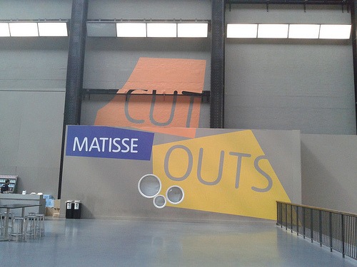
I got up early on Sunday to visit the Matisse: The Cut-Outs exhibition at Tate Modern. I’d booked my ticket in advance for the earliest possible time, hoping for a less crowded experience, but unfortunately it was still pretty busy. A worthwhile experience, though.

As the title suggests, the exhibition covers Matisse’s cut-outs, which he began to create towards the end of his life as ill health meant that he became unable to work and paint in his usual way. I think there’s something really inspiring about an artist driven to create by any means possible, overcoming obstacles to continue making work, and the cut-outs aren’t the childish simple pictures I’d wondered they might be. The images are deceptively simple and show how Matisse used colour and shapes in a creative and original way. My favourite pictures were the famous snail and the carnival images, especially the horse.

Saskia Olde Wolbers: ‘Yes, these Eyes are the Windows’

2014_0521VanGoghHouse

“Yes, these eyes are windows, and this body of mine is the house”
Herman Melville, Moby Dick

87 Hackford Road in south London is rather a special address – for a few short months between 1873 and 1874 it was the home of famous Dutch painter Vincent Van Gogh. A blue plaque marks out the building, which is currently home to an installation by Saskia Olde Wolbers, ‘Yes, these Eyes are the Windows‘.

Saved from demolition when a postman discovered the house’s famous former resident in the 1970s, the house has gone from strength to strength; it is currently empty – has been since 2012 – and Wolbers has taken the opportunity to create a fascinating experience, drawing on the history of the building.

Entry is timed: you ring the doorbell when the people in front of you have left the building, and when the time is right you enter and begin to explore, guided by the lights, haunted by the voices that surround you, telling stories of the house and the people who lived there. The house is in a shabby state, with peeling wallpaper, holes in the ceiling, and bits of furniture lying about. Lights, photographs and old newspapers emphasise the history behind the building. It’s an eerie experience, and one which will stay with me for a while.

Ruin Lust – Tate Britain

Last weekend marked the final weekend of the Ruin Lust exhibition at Tate Britain, so I decided to pop along. I am glad I did – it was fascinating, looking at the obsession with ruins that has plagued and surrounded artists for hundreds of years. There was an interesting mix of modern and older artists.

I love ruins myself, and when I think of obsession with ruins I tend to think of the Romantic love of crumbling abbeys, as evidenced in, for example, Wordsworth’s ‘Tintern Abbey’. There is a Turner watercolour of that selfsame abbey in the exhibition, as well as moonlit views of other ruins, which I thought were beautiful. I also loved John Martin’s ‘The Destruction of Pompeii and Herculaneum’ of 1822, which I had seen before, but which has lost none of its impact. Gustave Doré’s engraving ‘The New Zealander’ of 1872 shows an imaginary ruined London.

However, I also liked some of the more modern works, particularly Laura Oldfield Ford’s images of postwar council housing, both outside and inside, covered with graffiti-like marks. The exhibition seemed very quiet, which was a shame – I think it deserved to have been seen more widely.

Martin Creed: What’s the point of it? – Hayward Gallery

I nearly didn’t go to see Martin Creed: What’s the point of it? at the Hayward Gallery on the South Bank. I’d heard some ‘interesting’ things about it and I wasn’t sure if it was the kind of thing I’d enjoy. However, the exhibition proved so popular that it was extended for a week, and I went to see it on Thursday evening, after work and before I went to the theatre. I definitely advocate going to see exhibitions during late-night weekday opening – the exhibition was really quiet, and the balloon room – which can have queues lasting up to an hour – was nearly empty.

Creed’s work belongs to the category I normally term as ‘crap modern art’, and I found myself asking the question posed in the exhibition’s title – “What’s the point of it?” – rather a lot as I walked around. Which begs the question, why did I go and see it? Curiosity, I suppose.

Creed names his works by numbers and in fairness to him his work is incredibly varied. On the one hand, among the exhibits are a piece of Blu-Tack stuck to a wall, a crumpled piece of paper, and a number of wall protrusions. More interesting to me was the large ‘Mothers’ sign that whirls around your head as you enter the exhibition: the idea behind this is that when you are little, your mother seems big and scary, as does this sign. Creed’s love of order is evident in the Lego bricks piled one on top of the other in size order, and the chairs and boxes piled up in similar ways.

The exhibition even reaches outside, with a couple of works on display on the terraces. One of these is a car which randomly bursts into life, its doors shooting open and its radio blaring, although I was more concerned with how on earth they got the car up there in the first place. On another terrace there was a film of a penis going up and down (the woman standing next to me remarked “I’ve seen better”).

The ‘balloon room’, aka Work No. 200, Half the air in a given space, was the best. The room was filled with balloons taking up half the air, resulting in a really fun room where you wade through tons of balloons with static lifting up your hair. I had so much fun here I thought it was worth the admission price alone.

There were paintings and pictures too, as well as sculptures and installations. The pictures using highlighters appealed to my precise nature, and I really liked the prints made using broccoli! The final work, though, left me completely bewildered. The infamous “sick film” shows people walking in front of the camera, vomiting and walking away, except in one case where a woman walks up, squats down and takes a shit instead. You can also buy this film in the gift shop – I am honestly baffled as to why anyone would want to watch someone defecating or being sick, or if they did, why they would pay £15 for a DVD rather than just popping down to their local high street on a Friday night. Oh well.

Though I remain sceptical of many of the exhibits, I do feel that the exhibition as a whole proved more than the sum of its parts, with interesting things to say about order, space, ambiguity and not taking the art world too seriously. It was more thought-provoking than I had expected and on balance, I don’t regret going to see it – even if I can’t get the image of someone being sick out of my head…

United Visual Artists: Momentum – The Curve, Barbican

After the Jean Paul Gaultier exhibition at the Barbican I had a little time to spare and decided to pop in to Momentum. This exhibition is taking place in the Curve until 1 June and consists of “a carefully choreographed sequence of light, sound and movement, which responds to the unique space of the Curve.”

The environment was created after a lot of research and uses sophisticated technology. I can’t say that I was amazed by it, but I enjoyed the atmosphere, and the lights were rather hypnotic.

Estorick Collection of Modern Italian Art

2014_0406Estorick01
Estorick Collection of Modern Italian Art

Located near Highbury and Islington Station, north London, the Estorick Collection of Modern Italian Art is home to a wide variety of 20th century Italian artworks. It opened in 1998 with a permanent collection formerly belonging to Eric Estorick (1913-93), an American sociologist and writer. There is also a rolling programme of temporary exhibitions. The space is open Wednesday to Sunday, and it costs £5 to enter (£3.50 for concessions and £2.50 for National Art Pass holders).

The building is quite small so it didn’t take me long to look around. To be honest the permanent collection didn’t grab me as much as I’d hoped, but I found a few pictures that I liked.

2014_0406Estorick10
Estorick permanent collection
2014_0406Estorick13
Estorick permanent collection

The temporary exhibition when I visited was Giorgio de Chirico: Myth and Mystery. The artist is best known for his paintings, but here his sculptures are on display. I must admit I’d never heard of him, but I did like his modern, occasionally creepy sculptures.

2014_0406Estorick04
Giorgio de Chirico sculpture
2014_0406Estorick03
Giorgio de Chirico sculpture

The Estorick should appeal to those interested in modern and/or Italian art. I don’t know if I’ll be rushing back (unless there’s an exhibition I particularly want to see) but that’s just my personal taste. The place itself is very pleasant and worth a visit if you think it’s something you might enjoy.

FACTS

Address: 39a Canonbury Square, London, N1 2AN

Website: estorickcollection.com

Opening Hours: Wed-Sat 11am-6pm, Sun 12pm-5pm

Prices: Adult £5, Concession £3.50

Norman Stevens ARA: Selected Prints – Royal Academy of Arts

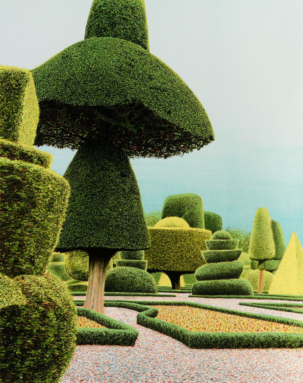
While in the Royal Academy I came across a small exhibition in the Tennant Gallery and Council Room. This was a selection of prints by Norman Stevens, and it was free with any other exhibition ticket, so I popped in. I had never heard of Stevens but I liked his prints: they were reminiscent of a dreamlike English ‘country garden’ but there was something unworldly or unnerving about many of them. I particularly liked his Levens Hall Garden, which reminded me of Alice in Wonderland.

Levens Hall Garden
Norman Stevens ARA Levens Hall Garden 1985 Screenprint Private collection © Estate of the artist

Renaissance Impressions – Royal Academy of Arts

While I was at the Royal Academy I decided to go and see Renaissance Impressions, which is running to the 8th of June in the Sackler Wing. This exhibition focuses on chiaroscuro woodcuts from the collections of Georg Baselitz and the Albertina in Vienna.

Before I visited, I had no idea what chiaroscuro woodcuts actually were, so I was happy to be enlightened. There is a helpful video at the beginning of the exhibition that shows you how they are made. They are like standard woodcuts – e.g. cut out a pattern on some wood (doh), cover with paint, and press onto paper – but you do it in layers. So you have one woodcut for the lighter tones, and you print that; then another for the highlights, and you print that; and finally, another for the outlines which is very dark. The technique results in beautiful, layered pictures full of atmosphere. Some are mainly black and white, while others involve the use of colour. There is more information, as well as a stunning selection of images, on the Royal Academy website.

Veronese: Magnificence in Renaissance Venice – National Gallery

I admit I had never heard of Veronese before visiting this exhibition at the National Gallery, but I was impressed with what I saw. Veronese: Magnificence in Renaissance Venice looks at the work of Paolo Caliari (1528–1588) of Verona (hence ‘Veronese’), who was one of the most acclaimed artists in late sixteenth-century Venice.

Fifty works are present in this, the first monographic exhibition on the artist ever held in the UK. The works, some of which are huge, have taken over some rooms above the Sainsbury Wing, and are shown off to wonderful effect owing to the rich natural light.

As well as the usual pictures and portraits, Veronese painted several altarpieces and frescoes. These are hugely difficult to transport from their original setting and help to explain why his work is less well known over here. I’m glad the effort was made, however, as they really are magnificent. Veronese also painted portraits, and drew inspiration from allegory and mythology. The paintings are stunning, with strong use of colour, and narratives that make an impact.