MAD Museum – Stratford upon Avon

2014_0703MADMuseum
Entrance to the MAD Museum on Henley Street

Yesterday I went on one of my many day trips to Stratford upon Avon. The show I was there to see didn’t start until 3 pm, which left me a few hours to kill. I’d wandered past the MAD Museum on Henley Street a few times, and thought the time was right for me to pay it a visit.

I walked in at the right time, as a huge school party was just leaving. There were only a couple of other visitors remaining, so I had most of the exhibitions to myself.

The museum has only been in existence since 2011 (it originally occupied premises on Sheep Street) but has already won several awards, including the TripAdvisor Certificate of Excellence for 2014. MAD is short for Mechanical Art and Design and the museum showcases kinetic sculptures and art. Think marble runs, but much more varied and elaborate!

The museum is full of delights, most of which are interactive: press a button and see what happens. My favourites were the typewriter converted to a music-making machine, thanks to wires connecting each key with a glass filled with water, and the large-scale ‘marble-run’ style sculpture set in a kitchen. Several of the works are available to buy, and all display remarkable ingenuity. This museum is an ideal place to visit no matter what your age or level of interest in mechanics – though I think someone interested in how things work would get the most out of it.

Making Colour – National Gallery

I had some time to kill last Sunday, so I popped into the National Gallery to visit their Making Colour exhibition. It proved to be one of the most interesting exhibitions I’ve seen for a very long time. The exhibition took a rather different focus, looking at the ways in which artists have used colour over the centuries and the difficulties they have faced in finding the right shade. I’m not an artist, although I enjoy looking at art, so I’ve never really thought about the restrictions artists face when it comes to paint.

Concerning Colour

The first room was about the early use of colour, and made the point that the modern theory of primary colours was only developed around 1600. However, earlier artists such as Annibale Carracci instinctively used colour to emphasise and contrast. Colour wheels were developed, in which colours lying opposite one another produced the most effective contrasts. This can be seen in later paintings by Renoir and Van Gogh: Renoir painted an orange boat against blue water while Van Gogh depicted orange crabs against a blue-green background.

Despite the conventional representation of an artist’s palette as neat with distinctly marked colours, in reality palettes were incredibly messy owing to the need to mix colours together to provide an accurate shade. J.M.W. Turner’s paintbox on display shows that relatively few colours were available to him, and his palette was hugely messy. Later on, paints were produced in tubes, making them more convenient and easier to transport; the Impressionists were among those artists who benefited from this development.

The Quest for Blue

The history of blue in art is a fascinating one. The second room explored the various kinds of blue available to artists, and the benefits and drawbacks of each. For centuries natural ultramarine, made with the rare and precious mineral lapis lazuli (mined in Badakhstan, now part of Afghanistan), was the highest quality blue available: it was more expensive than gold, and figures and amulets made with this mineral have been discovered in Middle Eastern graves. This is the reason why, in Western art, Mary (mother of Jesus) is often portrayed in blue robes – painting her robes with the most expensive shade available was seen as a sign of devotion. I found this really interesting, as I had wondered in the past why Mary was always depicted in blue. Ultramarine is stable and long-lasting: this is shown in Pierre Mignard’s painting “The Marquise de Seignelay and Two of her Sons” (1691) in which the colours are as fresh today as they would have been at the time.

Other, cheaper blues were available, but these came with their own problems. Azurite has a tendency to go green over time: the contrast between the greenish robes of Saint Peter (painted with azurite) and the rich blue robes of Christ (painted with ultramarine) in the painting “The Betrayal of Christ” (1324-5) by Ugolinodi Nerio is clear to see. Another option was smalt, but this is also unstable. In Jan Jansz Treck’s “Still Life” (1651), smalt was used and the blue has now faded to grey.

In the eighteenth century a synthetic blue, Prussian Blue, was created and manufactured in bulk. Though it did not have the quality of ultramarine, it was an improvement on what had gone before. Gainsborough’s portrait of Sarah Siddons (1785) shows that while the Prussian Blue has faded, it still looks better than either azurite or smalt.

A synthetic ultramarine, known as French ultramarine, was developed in the nineteenth century, and is still used to this day. Finally, an artificial shade was available that matched the results of natural ultramarine. It was used in such works as Monet’s “Lavacourt Under Snow” (c. 1878-81).

Painting Green

The story of green is another fascinating one. The need for green became more marked as landscape painting grew in popularity, with artists struggling to replicate the colours of the landscape in pigment. Two of the most common early greens were verdigris – taken from the surface of copper and bronze – and green earth, producing more muted greens. In Renaissance Italy, green earth was used as a base for faces: this is why they often appear to us to have a greenish tinge. In the nineteenth century, emerald green and viridian replaced earlier greens. Rousseau’s “Valley” (c. 1860) and Cézanne’s “Hillside in Provence” (c. 1890-2) are examples of paintings that made use of artificial greens.

Fashionably Yellow

Muted yellow shades – ochres – were available for many years, with artificial yellows becoming available during the Renaissance: relatively early compared to some other shades. Lead-tin yellow and Naples yellow were among the shades which came into the world of painting via ceramics: there are some interesting porcelain colour test plates on display. Anthony Van Dyck’s “Lady Elizabeth Thimbelby and Dorothy, Viscountess Andover” (c. 1637) and Thomas Gainsborough’s painting of his daughters chasing a butterfly (c. 1756) are examples of the use of these yellow glazes.

Orange could be created by mixing red and yellow, and red lead was also used until around the fourteenth century. Realgar, an orange mineral, was also used on occasion, but this was problematic as it contained arsenic, and was therefore poisonous.

Seeing Red

There were two main ways of creating red pigments. Vermilion was produced from the mineral cinnabar, and was also made artificially from the nineteenth century onwards. In addition, plant and insect dyes could be processed to create red lakes. Vermilion was a much brighter and more stable option, as shown in Masaccio’s painting of the saints Jerome and John the Baptist (c. 1428-9). Jerome’s robes, which were painted with vermilion, are still bright but John’s, which were coloured with red lakes, have faded to pink.

Royal Purple

Creating purple was less problematic than many other colours, as it could be mixed from blue and red. Paris Bordone’s “A Pair of Lovers” (1555-60) is an example of a painting that incorporates purple to give the illusion of rich silk. However, there were other ways of making this colour. The Romans used Tyrian purple made from shellfish, while in 1856 mauveine was patented by William Perkin, although the latter colour was chiefly used as a fabric dye. Queen Victoria and her family are pictured wearing purple in her cartes de visite, while paintings such as Arthur Hughes’ “April Love” (1855-60) capitalised on the popularity of the colour.

Gold and Silver

I found this section to be one of the most interesting in the exhibition. It appears that when real gold leaf is used in art, it is candlelight in which it appears to best effect: modern lighting makes it look flat and dull. Paint, which was increasingly used instead of gold leaf, actually looks better and more realistic to modern eyes. In terms of silver, paint effects were used to create the impression of this metallic shade. In Salvoldo’s “Mary Magdalene” (1535-40), the silver cloak was created using a mixture of lead white and lamp black.

I was really impressed with this exhibition. It was really different, and made me think about what goes into creating works of art. I have the utmost respect for artists in the past who had to make the best of the limited materials they had.

Windsor Castle

I finally got around to visiting Windsor Castle. About time, too, since I live in West London, so it’s really easy to get to. I had the day off work to go on a visit to the Royal Library; this wasn’t until the afternoon so I thought I might as well go round the Castle in the morning.

It’s impossible to miss Windsor Castle when you arrive in Windsor (I got the shuttle from Slough after the train from Paddington, which goes into Windsor & Eton Central; there’s also a train from Waterloo which arrives at Windsor & Eton Riverside). It towers over the small town, and there is only a short walk up a hill to the Visitor Centre. I was initially taken aback at the size of the queue, which extended all the way down the road; however, I soon discovered that this was the queue for groups, and individual visitors could go straight through. I paid and got inside within ten minutes.

2014_0626WindsorCastle05
The Castle, seen from just outside the Visitor Centre

The area covered by the Castle and the grounds is large, and I had a map and an audio guide to help me. The guides are full of information and very interesting, so I didn’t feel the need to go on one of the half-hourly Precinct Tours up to the State Rooms. I spent some time wandering about the grounds, learning about the history of the place, which has been home to English and later British royalty for hundreds of years.

2014_0626WindsorCastle17
Windsor Castle
Changing of the Guard

It was around eleven by this time, so I decided to go and see the Changing of the Guard, which happens every day at this time. There was quite a crowd, but the sloping bank ensured a good view for everyone. I last saw this ceremony years ago at Buckingham Palace. It is a very bizarre event and I am not sure why so much shouting is needed. It must be quite embarrassing for the soldiers having crowds of gawping tourists standing around, but I suppose they get used to it.

2014_0626WindsorCastle18
Changing of the Guard
St George’s Chapel

Afterwards, I decided to go and see inside St George’s Chapel, as I was right next to it. The chapel is beautiful and I think it was my favourite part of the whole experience. Sadly photos were not allowed, so you’ll have to take my word for it how stunning it was. Famous monarchs including Henry VIII and Charles I, as well as the current Queen’s parents and sister, are buried here, and the chapel is the spiritual home of the Order of the Garter, with ceremonial helmets – some of the most outlandish of which wouldn’t look out of place on Lady Gaga – on display inside. However, my favourite part was the small corner chapel in which Princess Charlotte is buried. This little-known Princess was the only (legitimate) child of George IV, much loved by the public, but she sadly died in childbirth in 1828; on her death, Princess Victoria – later one of our most famous monarchs – became heir to the throne. Her white marble tomb is a monument of sentimental Romanticism, with her dead body shrouded in a beautifully sculptured sheet, and angels lifting her and her stillborn child up to heaven.

2014_0626WindsorCastle24
St George’s Chapel
Queen Mary’s Dolls’ House

After coming out of the chapel, I wandered further into the grounds and made my way towards the State Rooms. There are two entrances here: you can go straight to the State Rooms, or stand in a queue to see Queen Mary’s Dolls’ House. In my opinion this is not to be missed. An exquisite replica of a stately home, it was built for Queen Mary by the leading British architect Sir Edwin Lutyens between 1921 and 1924. The amount of detail is striking: you could look at it all day and still not see everything. My favourite part was the library, with tiny miniature books (later, during my Royal Library visit, I was able to see some of these books close-up!). This area also has two larger, almost child-size dolls on display: called France and Marianne, they were presented to King George VI and Queen Elizabeth for their daughters, the Princesses Elizabeth and Margaret Rose, by the French Government during the 1938 State Visit to France. I have to say I was pretty envious of the dolls’ designer wardrobe!

Treasures From the Royal Archive

This area of the Castle is home to a series of temporary exhibitions. The current exhibition is called Treasures From the Royal Archive and I couldn’t imagine a better exhibition to catch my interest. The Royal Archive is made up of the official and private papers of the Sovereign and other members of the British Royal Family, together with the records of the Royal Household and the private Royal estates. Some of the exciting artefacts on display include Princess Elizabeth’s (the Tudor Princess Elizabeth, who later became Elizabeth I) account book from the mid-sixteenth century, the title deed for the purchase of Buckingham House (later Buckingham Palace) dated 1763, and a letter of condolence to Queen Victoria from US President Abraham Lincoln on the death of Prince Albert. Some of the items I found rather touching, such as Princess Elizabeth’s (the current Queen) written account of her parents’ coronation in 1937, and the telegram she sent to her own mother on her 100th birthday.

The State Apartments

The next stop was the State Apartments themselves. You may remember the fire of 1992, which destroyed much of this part of the Castle: I don’t, since I was only seven at the time, but the rooms have been rebuilt and refurbished, and the effect is impressive. There is a plaque marking the place where the fire began, near St George’s Hall and the Grand Reception Room.

I found my audio guide very helpful in this part of the castle, as there was a great deal of information to impart. The Castle has been the home of 39 monarchs over the years, but it is the influence of Charles II (r.1660-85) and George IV (r.1820-30) which is most marked. Artists whose work adorn the Castle walls include Grinling Gibbons, Rembrandt and Reubens. The Apartments are still used today on special occasions.

Facilities

There are toilets at various locations, and places to sit; there are a number of souvenir shops, and you can buy drinks and ice cream, but there are no cafes or restaurants. However, you can get your ticket stamped if you want to leave the Castle for a meal and then come back. My visit took me half a day, so it would certainly be possible to see everything you want to before having to leave to get food.

In common with other Royal Collection sites, your ticket – so long as it is not bought from a third party – is valid for a year after first entry, providing you get it stamped and signed by a member of staff. There is a desk for this down some stairs to the left as you leave the State Apartments. I fully intend to make the most of this, as I live within easy travelling distance of Windsor. I would also like to have the chance to visit the Semi-State Rooms, which are only open from October to March.

Windsor Castle is definitely worth a visit: with nearly 1000 years of history, and lots to see and do, it’s a really enjoyable day out.

2014_0626WindsorCastle19
The Castle, seen looking up from near the exit

Amy Sharrocks, Viktor Popkov and others at Somerset House

The other week I headed to Somerset House to visit a few exhibitions. Somerset House always has loads of interesting things going on, and I managed to see quite a few things, all of which were very different.

In the Lightwells and Deadhouse, in the basement of Somerset House, was the unique exhibition Museum of Water. Created by Amy Sharrocks as part of the LIFT Festival, the museum is made up of hundreds of vials of water, collected by the public. Every drop of water has significance, from the tears of grief collected after a death to holy water from the Ganges in India. It’s a fascinating exhibition, and it’s easy to spend ages just looking at the labels and finding out where all the water has come from.

I also saw Form through Colour: Josef Albers, Anni Albers and Gary Hume, an exhibition of rugs, tapestries and other fabrics. Not my usual focus of interest, but I loved the use of colour.

Return of the Rudeboy in the Terrace Rooms had pictures of individuals who embody this style in the 21st century, distinguished by sharp tailoring and impeccable grooming.

Finally, I saw an exhibition of works by a Russian artist. Viktor Popkov: Genius of the Russian Soul showcased the art of this 20th century painter. He was a Soviet artist, but his work encompassed much more than Soviet propaganda, showing the lives of the working classes in Russia and their fears, hopes and emotions.

The De Morgan Centre and Wandsworth Museum

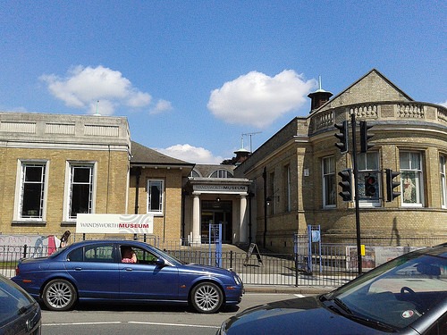
2014_0621WandsworthMuseum
Entrance to the building

As I had learned the week before that the De Morgan Centre and Wandsworth Museum in south London were due to close, I decided to visit both on Saturday morning. Located in the same building near Clapham, the museums were very different, but very interesting.

I visited the Wandsworth Museum first, which cost £4 and told the story of Wandsworth from prehistoric times until the present day. It was very similar to other local museums, following a chronological timeline incorporating stories of the world wars and the reminiscences of local people – but the temporary exhibition, about the history of hygiene and cleanliness in Wandsworth and beyond, was great fun.

The De Morgan Centre was free with my Art Fund card. The De Morgan Foundation owns ceramics and oil paintings by William and Evelyn De Morgan, a husband and wife active in the late 19th and early 20th centuries. Their work was key in the Arts and Craft movement, and several paintings had a distinct Pre-Raphaelite style. I don’t normally like ceramics, but those on display here were unusual and beautiful.

Ickenham Hall Open Day

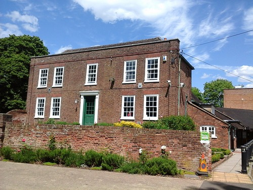
2014_0608IckenhamHall
Ickenham Hall

I’ve been to the Compass Theatre in Ickenham a couple of times: a theatre attached to a beautiful old building called Ickenham Hall. The Hall had a free Open Day on Sunday, so I went along to take a look around and attend a talk.

Dating from 1740, the Georgian Ickenham Hall is Grade II listed. It’s a beautiful building, though in need of some repair, for which the Friends of the Hall are trying to raise money. Exploring it is very exciting, especially given that some doors have been boarded up and walls taken down; it’s fun trying to spot where changes have been made. Unfortunately the building suffers from some dodgy paint colours and, most horribly, neon strip lighting in the beautiful old rooms, and apparently as it was given listed status after these lights were added, they can’t be removed. I do hope this situation can be resolved somehow, as it would be lovely to see the house restored to its full glory.

Vikings: Life and Legend – British Museum

The Vikings: Life and Legend exhibition at the British Museum has proved very popular, so I made sure to book well in advance. I was pleasantly surprised to find it wasn’t as busy as I’d expected – perhaps the BM have decided to control numbers when it comes to entering exhibitions.

I went to the exhibition with five friends, but owing to the need to book in advance, we were all due in at slightly different times. It didn’t matter though as we were each absorbed by the exhibition while we were in there, and we were able to compare notes afterwards.

There was a great deal of Viking archaeology: the main thing I took away from the exhibition was that the Vikings liked bling. The bigger and more bejewelled your brooch, and the more precious the metal from which it was made, the more important you were in Viking society. There were a few brooches that took things a bit too far: they were huge, designed to be pinned to the side of tunics, and had massive spikes which could easily put out the eye of the person standing behind you. Further evidence that size mattered to the Vikings came in the form of boats: the remains of a huge longship form the focal point of the exhibition, and are very impressive.

I liked the way the exhibition emphasised how the Vikings traded with other societies, borrowing ideas and sharing their own. Another of my favourite items was a brooch covered in little bears, the result of this kind of inspiration. However, the display did not shy away from examining how the Vikings were fond of a fight. They didn’t always win though – at one chilling point we saw the remains of several Viking sailors and warriors, killed during a raid and buried where they fell.

I would have liked to find out a bit more about Viking mythology and belief – there was some information at the end but not as much as I would have liked. However, I really did enjoy the exhibition and thought it was definitely worth the advance planning.

Ragged School Museum

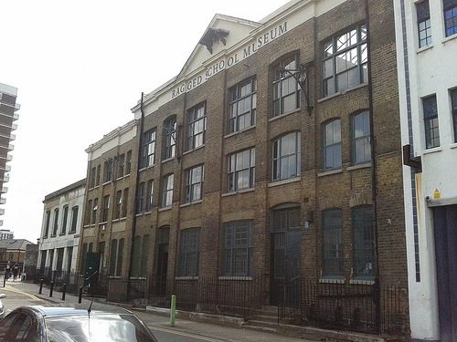
2014_0601RaggedSchoolMuseum01
Ragged School Museum

One sunny Sunday I headed to London’s East End to have a look around the Ragged School Museum. It is open on the first Sunday afternoon of every month for anyone to visit, and for school groups at varying points during the week. The building, and those adjoining, was once the largest free or ‘ragged’ school in London, and was founded by Thomas Barnardo, now famous for the children’s charity that bears his name.

2014_0601RaggedSchoolMuseum02
Victorian schoolroom

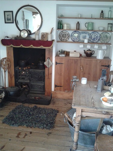
It is possible to have a ‘lesson’ in the school’s Victorian classroom, but I left that to the kids, and looked over the rest of the museum instead. It has a very interesting display on East End history, as well as information about the school and Barnardo himself. There is also a Victorian kitchen at the top of the building.

2014_0601RaggedSchoolMuseum03
Victorian kitchen

This interesting little museum is definitely worth a visit. It would be ideal with children, but there is enough to see for adults, too.

FACTS

Address: 46-50 Copperfield Rd, London, E3 4RR

Website: raggedschoolmuseum.org.uk

Opening Hours: Wed-Thurs 10am-5pm; 2pm-5pm first Sunday of each month

Prices: Free

Matisse: The Cut-Outs – Tate Modern

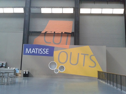
2014_0601Matisse

I got up early on Sunday to visit the Matisse: The Cut-Outs exhibition at Tate Modern. I’d booked my ticket in advance for the earliest possible time, hoping for a less crowded experience, but unfortunately it was still pretty busy. A worthwhile experience, though.

As the title suggests, the exhibition covers Matisse’s cut-outs, which he began to create towards the end of his life as ill health meant that he became unable to work and paint in his usual way. I think there’s something really inspiring about an artist driven to create by any means possible, overcoming obstacles to continue making work, and the cut-outs aren’t the childish simple pictures I’d wondered they might be. The images are deceptively simple and show how Matisse used colour and shapes in a creative and original way. My favourite pictures were the famous snail and the carnival images, especially the horse.

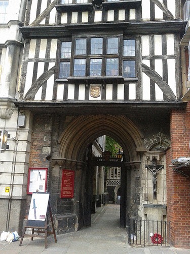
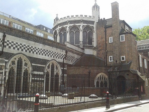
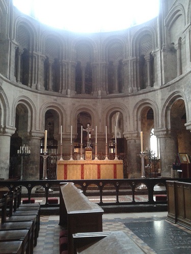
Saint Bartholomew the Great

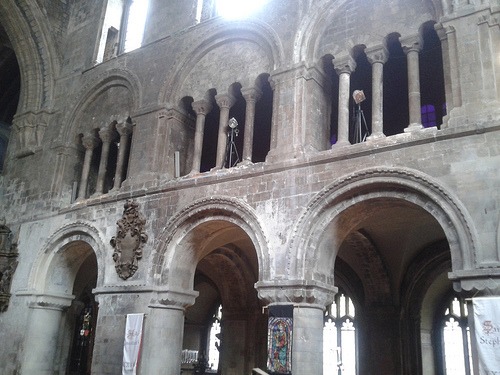
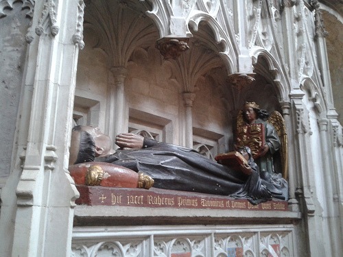
Saint Bartholomew the Great is one of London’s oldest churches. It was founded as an Augustinian Priory in 1123 and has been in continuous use since 1143. It is an Anglican/Episcopal Church in that part of London known as the City, and I visited on Saturday to see a performance of T.S. Eliot’s play Murder in the Cathedral, about the murder of Thomas Becket.

The church is beautiful and has featured in films and TV shows such as Shakespeare in Love and The Hollow Crown.

2014_0524StBarts01

2014_0524StBarts02

2014_0524StBarts03

2014_0524StBarts04

2014_0524StBarts05

2014_0524StBarts06

2014_0524StBarts07

2014_0524StBarts08